Choice of colour scheme is very much down to individual taste. My two previous builds have both had a varnished top strake and various amounts of varnish on the thwarts etc.
On the Oughtred boat I used Le Tonkinoise varnish which is lovely to use and doesn't need to be sanded between coats. The hull was painted in Blakes Biscay Grey with a Pearl White interior. Both colours now defunct along with Blakes, now Hemple.
For the Coot I decided to make it a bit simpler and originally only had one colour, Pearl White again and this time I used B&Q decking oil for the spars and thwarts etc. This worked really well on the Douglas Fir spars but not so well on the Sweet Chestnut Thwarts.
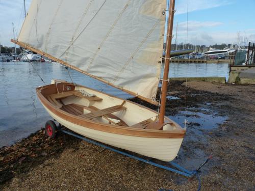
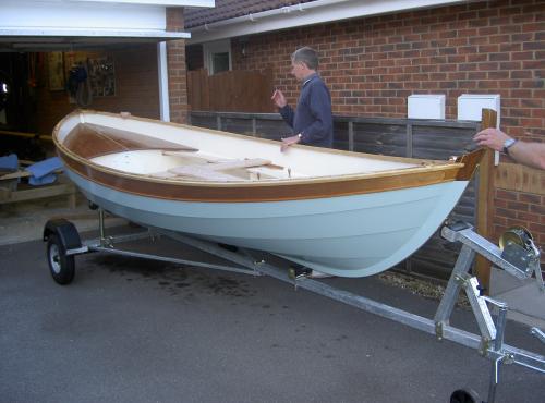
For the Morbic this time I have reduced the amount of Oil/Varnish even further and done away with the contrasting top strake in an attempt to reduce maintenance.
I'm using Deks Olje for the Brightwork, D2 in the boat and D1 for the spars.
The Hull Colour is Pidgeon Blue with a grey interior.
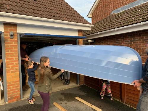
The Grey is to avoid glare and hide the dirty marks which will inevitably happen.
The paint I'm using is Jotun Easy Gloss which was supplied by Marine & Industrial
https://www.marineindustrial.co.uk/Catalogue/Paints-Coatings/JOTUN/Yachting-Retail/Top-Coats/JOTUN-EasyGlossThey can mix this to match any colour provided you can supply the RGB code.
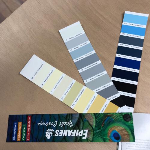
Having so much choice can be a problem when it comes to choosing, and I prevaricated for weeks playing around with various options on Photoshop.
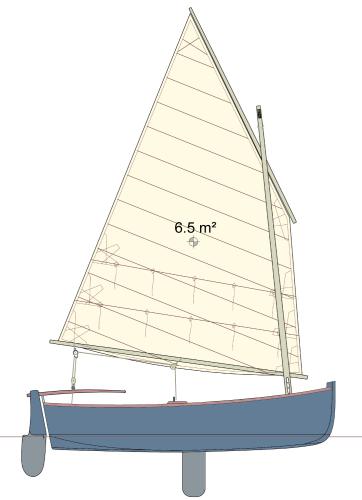
This is actually a Morbic 10 but it gives an idea.
And finally; the clinker plank edges cast a downward shadow which will show off any lumps and bumps against a light colour. So if you need to hide anything, go dark.
Graham Neil
https://port-na-storm.blogspot.com/